

Using Colorways
(Post updated Jan 2020)
You’ve probably heard me talk about having a “(home)base palette” of around 8 or 9 colors that you know really well and use to mix most of the colors in most of your paintings. But there are times when you want to bring in other colors, perhaps for a special project or series. One example is when you know a painting or series of paintings needs to work well under particular lighting (e.g. fluorescent lighting in a business or commercial setting) or you want to coordinate with a particular decor.
Like most of you, I have many (probably too many!) tubes of watercolors tucked away in my studio. How do we go about making intelligent choices of which ones to use?
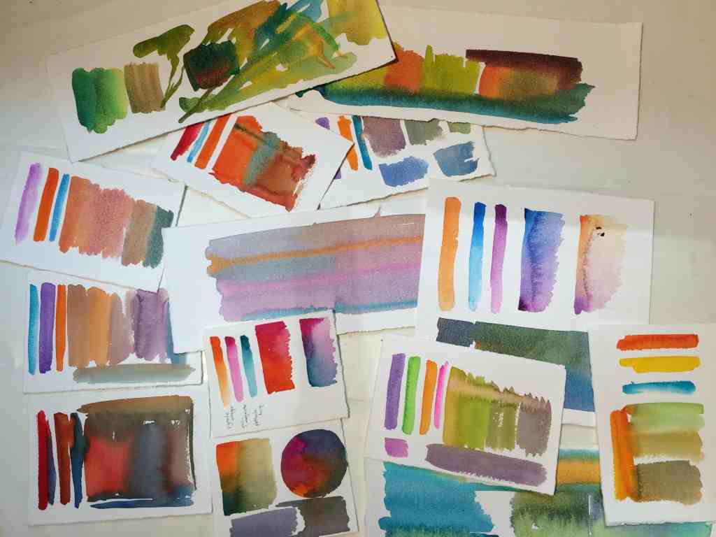
One way to keep from being overwhelmed—and to make sure the work hangs together well—is to select a limited collection of pigment combinations to use throughout the series. Borrowing a term from fiber artists, I call these my “colorways” for the series.
Each colorway starts with a “primary triad” and possibly a fourth or (very rarely) a fifth color. The notion of “primary” really gets stretched here. For example, one colorway that I’m working with now consists of quin gold as my “yellow”, phthalo turquoise as my “blue” and permanent violet as my “red”.
One colorway can give many different looks depending on which color I use as the dominant color in the painting, whether I use bright or muted colors, pale or dark versions of each color, etc.
If I’m creating a series of paintings I don’t necessarily use the same color way for each painting, but I try to make sure that all the colorways for the series share a couple of prominent colors. Typically, there is enough overlap in the 3 or 4 colorways within a series that I’m using about 7-8 pigments for the entire series. This gives me a unified look, without getting too repetitive.
For me, the process of choosing these colors takes some experimentation. I often don’t know for sure if I like something until I see it on the page!
I choose my colorways by “swatching”. Actually playing with the pigments—wet-in-wet, premixed on the palette, dropping color into partially dry washes—is an essential step for me. You know how I’m always advising you to “deal with one difficulty at a time”? Yeah. I have to give myself that advice, too.
There’s no substitute for messing around with the actual pigments, but it also helps a lot to read about pigments and color theory. Here are a few of the resources on pigments and color that I find myself returning to again and again.
(And, of course, the best resource of all—your brushes and paints! If you haven’t allowed yourself to just play with color for a while, why not haul out your paints and do a little color exploration of your own!)
History of Color and Pigments
Color: A Natural History of the Palette, Virginia Finlay.
Finlay has also recently released a newer book on color with a lot of color plates and examples. The new book is visually appealing, but I think the one mentioned above is more readable.
Bright Earth: Art and the Invention of Color, Phillip Ball.
Absolutely fascinating chronicle of the interaction between art movements, art personalities, commercial uses of color (especially dyestuffs), politics, color chemistry and culture. Hands-down my favorite book about color in art.
Practical Information and Learning Activities for Painters on Using Color Effectively
Making Color Sing (25th Anniversary Edition), Jean Dobie.
Probably the gentlest introduction to the practical application of color theory in watercolor, with plenty of exercises you can try with your own paints to understand the concepts.
Color Choices, Stephen Quiller
A great introduction to the most common way of discussing color combinations (complementary/split-complementary/monochrome/analogous). Quiller also markets a palette (and recommended colors for it) arranged in a color wheel (with special wells for primaries) to help students learn to mix and understand colors. If you find yourself struggling to mix your own greys or mute color with complements, this book (and perhaps the palette) can be very helpful.
Online and Interactive Color Tools (Just for Fun!)
Color theory: handprint.com This whole site is a cornucopia of information about color, pigments, color theory, color vision (and much more). The site’s author, Bruce McEvoy says, accurately “Here is the most comprehensive discussion for artists of color perception, color psychology, “color theory” and color mixing available online, and one of the most comprehensive available anywhere in any format.”
If you’re an iPad user, you can buy one of the classic texts on color theory, Josef Albers’ Interaction of Color made interactive as an iPad app. The entire text of the book is embedded in the app (paid version), and the app allows you to explore his color theory ideas by doing the various exercises and experiments on the iPad as you read the book. (There is a “free” version, but it’s really more of a sample version. The full version seems rather pricey for an app until you realize you’re actually buying a book with added interactivity.)
Golden’s online virtual paint mixer
Test out how various Golden acrylic colors will mix without buying them. Since color is represented very differently on a computer monitor than the way actual paint behaves, this is a more sophisticated piece of software than you might realize at first.
Fun way to “try before you buy”, but also a way to explore the mixing of a lot more pigments than most of us would want to purchase just to practice with. Although there are some differences between the color lines for watercolor and acrylics, much of what you learn here will transfer to watercolors.
X-rite online color perception challenge
Want to find out how good you are at distinguishing different colors? Try this online color perception challenge.
The quality of the monitor you’re using and the lighting in the room can affect your score somewhat, so don’t be dismayed if you don’t score quite as high as you expect. Try again in a darker room or on a high-quality monitor. I’m betting most of you will score quite high on this challenge!


